In the digital age, having a well-designed website is critical for any business or organization. Unfortunately, there are some terrible websites that miss the mark. These websites are plagued by poor user experience (UX), outdated design choices, and a complete disregard for responsive design best practices. Below are my picks for the top 10 worst website designs, and why they serve as prime examples of what not to do.
1. Heaven’s Gate

The Heaven’s Gate website is a haunting memory from the early days of the internet. With its pixelated images, clunky navigation, and an overwhelming amount of text, the site fails to engage users effectively. It’s also unresponsive, meaning that it’s almost unusable on mobile devices. The poor UX is partnered with the lack of any modern design elements, making the site feel not just outdated, but also inaccessible.
Why it’s bad:
- Outdated, unresponsive design.
- Poor UX with cluttered and hard-to-read content.
- No consideration for mobile or tablet users.
2. Arngren

Arngren’s website is a visual nightmare. The site is overloaded with images, text, and links, all vying for attention in a chaotic mess. There’s no clear visual hierarchy, making it nearly impossible to find what you’re looking for. The site also ignores responsive design entirely, leading to a frustrating experience on any device other than a desktop. This disregard for basic UX principles makes the site nearly unusable.
Why it’s bad:
- Overcrowded layout with no clear structure or hierarchy.
- Non-responsive design, making it difficult to use on mobile devices.
- Bad UX due to overwhelming and cluttered content.
3. Ling’s Cars

Ling’s Cars is known for its brash and chaotic design, which might be memorable, but not in a good way. The site bombards users with flashing graphics, autoplaying videos, and an overwhelming amount of information. The UX is poor, as users struggle to navigate through the clutter and find relevant information. Additionally, the site’s lack of responsiveness makes it difficult to use on mobile devices, alienating a large portion of potential customers.
Why it’s bad:
- Overwhelming sensory experience with defective UX.
- Cluttered and difficult to navigate.
- Non-responsive, making it challenging to use on mobile devices.
4. Yale University School of Art

One would expect a site from Yale’s School of Art to be a showcase of creativity, but instead, it’s a lesson in what not to do. The design is so minimalist that it borders on barren, with confusing navigation and unpredictable layouts that frustrate users. The site lacks responsiveness, making it difficult to access on mobile devices, which is a significant oversight in today’s mobile-first world.
Why it’s bad:
- Overly minimalist design that sacrifices usability.
- Confusing navigation and unpredictable layouts.
- Poor responsive design, limiting accessibility on mobile devices.
5. Kids Dinosaurs

Kids Dinosaurs feels like a relic from the early 2000s. The site’s outdated graphics and basic layout fail to engage its target audience: children. The dense text is not only hard to read but also unappealing to younger users. The site does not follow responsive design principles, making it hard to navigate on tablets or smartphones, which are popular devices among kids.
Why it’s bad:
- Outdated design and graphics that fail to engage.
- Dense, unappealing text for a young audience.
- Lack of responsive design, limiting accessibility on mobile devices.
6. Dreamland Resort

Dreamland Resort’s website is another example of an outdated design that ignores the principles of good UX. The site is cluttered with walls of text and outdated graphics, making it difficult to navigate. There’s no mobile responsiveness, meaning the site is almost unusable on smartphones and tablets. The poor UX and lack of accessibility make it a frustrating experience for users.
Why it’s bad:
- Cluttered and outdated design.
- Poor navigation and lack of clear structure.
- Non-responsive design, leading to a poor mobile experience.
7. Green Financial

For a financial services company, Green Financial’s website is surprisingly uninspired. The design is dull, the layout is basic, and the site lacks any modern features that could enhance UX. The site does not adapt well to different screen sizes, leading to a subpar experience on mobile devices. This disregard for responsive design and UX makes the site feel unprofessional.
Why it’s bad:
- Dull and uninspired design.
- Lack of modern UX features.
- Poor responsiveness, leading to a suboptimal mobile experience.
8. Hack Repair

Hack Repair’s website suffers from being overly text-heavy, with long blocks of information that overwhelm visitors. The design is simplistic, but not in a good way—it lacks any real visual appeal and feels outdated. The site’s lack of responsive design makes it difficult to read and navigate on mobile devices, further diminishing the user experience.
Why it’s bad:
- Overwhelming amounts of text with poor UX.
- Simplistic and outdated design.
- Non-responsive, making it challenging to use on mobile devices.
9. Rover’s Morning Glory

Rover’s Morning Glory might be a popular radio show, but their website doesn’t reflect that popularity. The site is visually overwhelming, with loud colors, busy backgrounds, and poor font choices that make it hard to read. The navigation is confusing, and the layout is inconsistent, leading to a frustrating user experience. The lack of responsive design further alienates users on mobile devices.
Why it’s bad:
- Visually overwhelming with poor color and font choices.
- Inconsistent layout and confusing navigation.
- Poor responsive design, making it difficult to use on mobile devices.
10. Craigslist
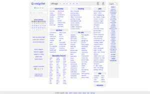
Craigslist is one of the most popular websites on the internet, but it’s also one of the most visually unappealing. The site has stuck with the same barebones design for decades, and while this minimalism might be part of its charm, it also results in a poor UX. There’s no visual hierarchy, the design is unresponsive, and the navigation is clunky. On mobile devices, the experience is even worse, with awkward layouts and difficult-to-use forms.
Why it’s bad:
- Extremely outdated design that hasn’t evolved with the times.
- Poor UX due to lack of visual hierarchy and clunky navigation.
- Non-responsive design leading to a subpar mobile experience.
In an era where good design and user experience are paramount, these terrible websites serve as stark reminders of what happens when best practices are ignored. Whether it’s outdated design, poor UX, or a complete disregard for responsive design, these websites highlight the importance of keeping up with modern web standards.
